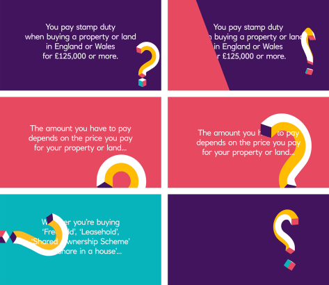
A characterful question mark leads us through a number of property related money matters in this series of animated videos for NatWest.
From Remortgaging to Stamp Duty, Money Bites provides an amusing and informative guide to help people navigate the complex and jargon filled world of property.
Working with our friends at Green Rock, we developed the distinctive NatWest question mark into a lively animated character to help guide us through each subject. The spots were then built into a number of templated videos that feature on NatWest’s Facebook page.
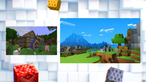
Playcraft Live is an exciting new project to create the world’s first play inside Minecraft.
The play was performed live on stage at The Playhouse Theatre in Derry/Londonderry and screened online as part of a global livestream event.
To accompany the production, we created a playful and energetic graphics package based around the distinctive Minecraft cube. The graphics included title stings, multi-screen templates, transitions and on-screen announcements.
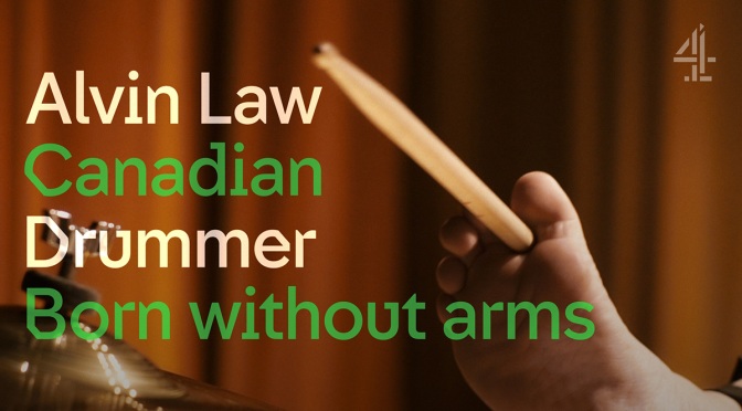
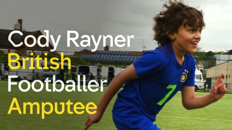
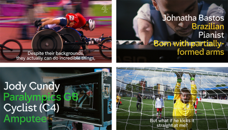
The Superhumans return for the Rio 2016 Paralympic Games on Channel 4.
Reuniting with 4Creative, we produced a series of social media captions and subtitles as part of their stunning campaign that goes well beyond sport. Our task was to advance the social branding we first created for them nearly a year ago and reflect the Rio 2016 brand colours within the typography.
The films we worked on included a series of 12 short Superhuman Stories and a set of adrenaline packed promos, featuring nostalgic moments from the 2012 Games in London.
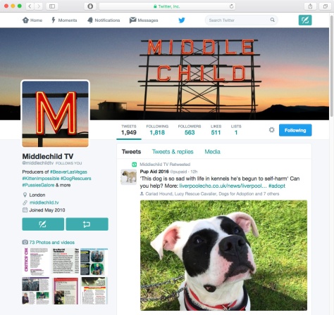
We’ve just finished a new logo update for TV production company, Middlechild Productions. They asked us to revamp their existing graphic logo into something more impactful with loads of photographic detail.
Based on the neon sign from the famous Public Market in Seattle, we used a mix of 3D and photography to create their very own imposing sign set against a panoramic landscape.
Twitter page
We created a number of versions ranging from full width banners to small avatars for web and social media as well as simplified graphic versions for print.
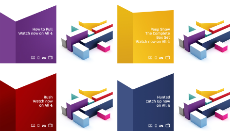
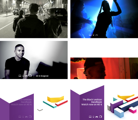
All 4 asked us to design and develop a new promo packaging solution that caters for trails which aren’t suited to the current ‘small screen’ format used throughout the network.
After numerous tests we settled on a combination of two distinct branded elements. An elegant central tagline featuring the device icons and caption, and a bespoke All 4 endboard branded individually for each network channel. Click here to read more.